Transit : Rest Mode Feature Design
Feature Design | Navigation Experience | Transportation App
Rest mode allows you to take a nap, read or do anything that you want to do on your journey without having to worry about skipping or missing your stop.
Impact:
Elevating rider experience by reducing cognitive load by 10% and emotional load by 12%. Follows WCAG contrast-compliant and voice-over experience.

Role
UX/UI Designer
Prototyping
High Level Goals
Notifying riders when their stop is near
Reducing cognitive and emotional load
Improving rider experience
Timeline
2-3 months
Tools
Figma, Adobe InDesign
Introduction
A little about Transit App
A transit app is a mobile application designed to help users navigate public transportation systems efficiently. These apps provide real-time updates on bus, train, and metro schedules, route planning, and live tracking to ensure smooth commutes. Many transit apps integrate multiple transportation modes, such as rideshare, bike rentals, and walking directions, offering a seamless travel experience.
Key Features of Transit
-
Real-time Tracking: Live updates on vehicle locations and estimated arrival times.
-
Route Planning: Multi-modal trip planning based on user preferences.
-
Service Alerts: Notifications about delays, cancellations, or maintenance.
-
Fare Information: Ticket prices, digital payments, and fare comparison.
-
Accessibility Options: Information on wheelchair access, elevators, and priority seating.
What's missing?
Wake up, this is your stop
Have you ever tried to take a short nap on a train or bus, only to wake up at the last stop?
We understand that travelers experience anxiety about missing their stop, constantly checking their phones for location updates and stop information. This not only adds cognitive load—forcing them to repeatedly refresh and re-read the screen—but also creates unnecessary stress, making the journey less relaxing. We know that our travelers would like to relax, read, nap or just catch up on some work while they are commuting. To enable a relaxing experience, notifying our users at the right time is extremely important.
What the experience looks like without rest mode


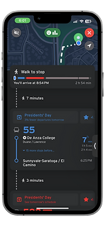

Continuously keeping this screen on
User Frustrations
What are the pain points?
Alex is a busy professional who relies on public transportation to get around the city. He often use commute time to catch up on podcasts, read, or even take a short nap. However, they frequently feel anxious about missing their stop, especially during late-night or long rides.
Constantly checking the phone to track location and upcoming stops
Cognitive overload form toggling between screens and refreshing the app
Increased stress during travel, making the journey less pleasant
Preferred Features
Features to improve the experience
After gathering all the insights and exploring different solutions to eliminate the pain points, the following features were finalized before exploring different design solutions.
Rest Mode
A dedicated feature that allows users to set their destination and receive alerts before arriving. This helps them relax or even take a nap without worrying about missing their stop.
Vibration and Audio Notifications
Instead of requiring users to constantly check their screens, subtle vibrations or voice alerts can notify them when their stop is approaching, making the experience more hands-free and convenient.
Customizable Alerts
Users can personalize how and when they receive alerts, such as choosing between vibration, sound, or pop-up notifications. They can also set reminders for multiple stops, which is useful for transfers.
Rest Mode Information Architecture
Turning insights into interesting feature

Notification Placement Options
Notification display options


Exploring various display options across different scenarios is essential for refining notification design. By adapting notifications to context, we can maximize their effectiveness while minimizing cognitive load, creating a smoother and more user-friendly experience.

Compact Notification – A minimal, non-intrusive banner that appears at the top of the screen while the app is open or in use. It provides a short message, such as "Approaching your stop – 2 mins left," ensuring quick glanceability without disrupting the user’s activity. This type of notification is ideal for users who are actively engaged with their phone but need a subtle reminder without overwhelming their screen.
Expanded Notification – A more detailed version that users can expand to see additional information. It includes details like the stop name, estimated time, and quick action buttons, such as snoozing the alert or changing the destination. This notification type is useful for those who need more context without opening the app, allowing them to manage their journey efficiently.
Locked Screen Notification – A persistent alert displayed on the lock screen, ensuring visibility even when the phone is not in use. It provides key details, including stop information and alert type (sound/vibration), making it especially helpful for hands-free use when a user is resting, listening to music, or multitasking. Users can tap the notification to open the app or dismiss it without unlocking their phone.
Using mobile-first approach
Designing form compact to expanded
Designing for small screens first, also known as the mobile-first approach, prioritizes the most essential elements and ensures a seamless user experience before adapting to larger screens. This method emphasizes simplicity, clarity, and usability, which can then be scaled up for tablets and desktops.
Compact

Expanded
Locked Screen


With limited space to convey notifications, such as an alert reminder, you are pushed to make tough decisions to prioritize important information from the start. This approach ensures that you are optimizing the pixel space to the best. The compact feature consists of Transit App logo, how far you are from the destination and a dismiss button. When expanded, it gives the same information in detail and a bigger dismiss action. When it appears on locked screen, it gives a detailed live movement bar, with an active (vibrating/sound) dismiss button and how much was the rested time.
Method
Steps to scale up live notifications
Prioritize Key Content: Start with the most essential information and interactions, ensuring they fit well on a compact notification banner on the top screen.
Optimize Touch Targets: Design buttons, links, and interactive elements to be easily tappable on small screens.
Use Responsive Layouts: Implement flexible grids and media queries to adapt the design smoothly to larger notification banners.
Enhance for Larger Banners: Once the compact version is solid, add advanced interactions, multiple columns, and richer content for expanded and locked screen banners.
Exploring options
An ocean of locked screen UI Options


Live movement Visualization


After thorough explorations, all the designs were tested with participants to select the best approach to send alert notifications to travelers. By combining the familiar form and direction of the progress bar and live location point design used by Transit, we were able to deliver a minimal yet impactful feature.
What the experience looks like after rest mode
Final look of the feature


Rest Mode doing it's magic
Impact
How the rest mode changed the experience
10 % decrease
Cognitive Load
12 % decrease
Emotional Load/ Stress Level
Reflection
Learnings and Takeaways
Empathy matters
Designing with empathy, considering how users will interact with the product in real-life scenarios (e.g., multitasking or napping during travel), helps create more thoughtful and impactful solutions.
Design compact first
Starting with compact-first design ensures core functionality and simplicity, which can then be expanded thoughtfully for larger banners/ pixels, preserving the user-friendly experience.
Simplicity drives effectiveness
Streamlining complex tasks (like tracking stops) into simple, intuitive solutions reduces cognitive load and fosters a more enjoyable, stress-free user experience.